So far things are fairly good with SF7, but I think the Downloading queue may need some work - see below.
Just some other feedback based on my experiences so far:
Preference: Like others, I also prefer the doenwloading dialog box to show codec/audio options at the left and titles at the right, simply because more of the title was visible. That’s especially helpful on Amazon and other source providers when dealing with multiple seasons and multiple levels of nested Extras.
Issue: Peacock is showing the wrong logo - shows an “N”.
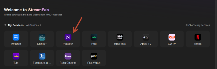
My Services Request: I’m glad the Home > My services icons now dynamically display over 2 rows based on window width, however, can you raise the limit above 12? Not sure the reason for that, but I have about 16 providers I use frequently and would prefer to have all of my favotites listed under My Services, not just 12.
Downloading Queue Issue and Requests
In SF6.x, the Queue automatically expanded groups as each title started to download. You could choose to “download-now” from a source provider page, and when you opened the queue you’d see that title (ex: a TV series with multiple seasons) expanded and showing a green progress bar and the status, and titles below marked “Waiting”, It was very clear what was happening.
In SF7, you can choose to “download-now” but there are NO expanded groups and no indicators until I choose to hover over a group title to see a super-tiny icon, or expand it manually to see the status.
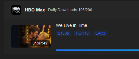
Here’s an example: I chose to “add to queue” the first title below (Pluribus, from AppleTV) and to “download-now” another title (movie “We Live in Time” from HBO Max).
Image A: Download icon at left shows download in progress, but no visuals on the queue of what is being downloaded.
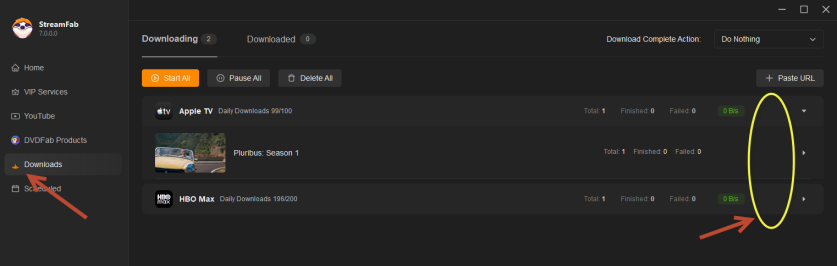
Image B: Hover over the second row, see a super-tiny pause icon
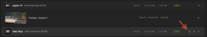
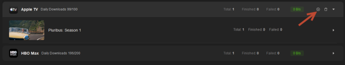
Image C: Hover over the first row, see a super-tiny play icon
Downlaod Queue Requests:
Match SF6 behavior and always expand a gorup that is in progress.
Please consider always showing the play/pause/delete icons so hover isn’t required, and please resize them larger. They are too small on a high-res monitor.
Please also reconsider the “blue” text on the dark background - it’s not easy to read (too little contrast). The colors in SF6 worked well for me.
Hope the above can be fixed/included in an upcoming release. Thank you!


